Developing this website
We were in need of a new website. Does this situation sound familiar?
Our existing website had over 1,200 pages and posts, it was running WordPress with a bespoke theme and many plugins in various states of maintenance, the design felt dated and it was difficult to find content - menus and navigation had grown naturally as sections had been added but without a clear structure. On top of that, the search facility was difficult to use and inaccurate.
More positively; it was well-used - by people sharing posts by our policy team, reading pages about how to set up and run a charity by our information service, and finding out about the employability programmes we manage - and a lot more besides.
Building a new website would also allow us to shut down a number of standalone websites which were set up for various reasons.
In this post, I'll explain how we planned and designed a new website which would address user needs, satisfy internal stakeholders, have a modern design, and be highly flexible for future changes in requirements.
Background
The purpose of SCVO website - as with any corporate/organisational website - should be to promote what the organisation does, provide a platform to allow press releases and blog posts to be publicised, and to advertise services.
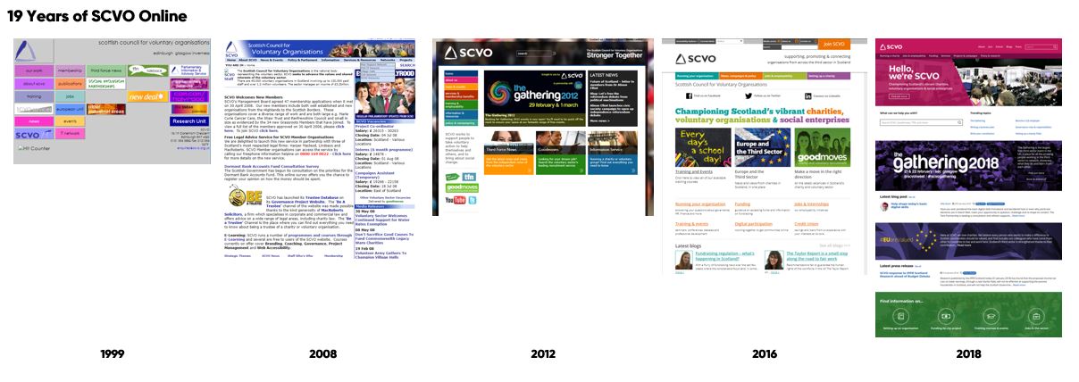
SCVO has a long history with an online presence - over 19 years.

It's fascinating to use the Wayback Machine to look at old versions of websites. The oldest copy of the SCVO home page available there is from October 1999. You can see how design trends, like fashion, have changed over the years - especially regarding page width and use of larger images. It's like a time machine to the early days of the world wide web. It's also interesting to see how some things haven't changed so much - the SCVO logo, the names of the key sections of the website, and a bold colour palette.
At the outset of this development process, our online profile was disparate - it was difficult to navigate, both between websites and also within the main SCVO website. This gave the impression that SCVO was lacking in coherence and focus. It was also hard for people to find relevant content - it was often more effective to use a search engine such as Google than to use the search function of the website.
Planning
We began the process of building a new website by taking a step back from the content and design to document the user needs that should be addressed by the website. We were also keen to understand how the website was being used by the public on a daily basis as this would help inform key priorities for development.
At an early stage, we took stock of our portfolio of websites to identify which may be in scope to integrate into the main SCVO website. For contractual reasons, some couldn't be integrated but there were opportunities to retire both the standalone Digital team website and the SCVO Evidence Library database if their content could be copied into a new SCVO website.
Our existing website used Google Analytics which allowed us to understand how people were using it - what keywords they were finding pages with, their routes following links, and where these visits were ending.
The following is an analysis of audience types by our Communications team:
There are four main audience profiles:
Doers
They want practical resources to help people run their organisation – information, events, funding, training, services & deals, professional networks etc.
Job smarts
Current/prospective employers, employment advisors, students and job seekers are all regular visitors to our website, looking for opportunities and resources (such as application forms). Includes non-sector visitors interested in our employability programmes make up a large proportion of visits to the website.
Newbies
A large proportion of people visiting our website want to “set up a charity”. This section guides people who are new to the sector through setting up a not-for-profit organisation and the options available to them.
Political animals
Focus on current affairs activity – welfare cuts, public service reform, referendum etc. Relevant to the sector, media, MSPs and activists - campaigning, news, policy.
Doers and Job Smarts are the main visitors to the website.
Newbies and Political animals are less prevalent but are key audiences for us.
Our key objectives in the context of the website redevelopment include
- Getting young people and people in vulnerable groups into jobs with charities via the Community Jobs Scotland scheme.
- Rolling out Good HQ as a trust and engagement platform for the sector.
- Running big showcase events for the third sector, including the Gathering and the Scottish Charity Awards.
- Influencing governments on behalf of the third sector.
- Providing trusted information on running charities to our members and the wider sector.
- Letting people apply for jobs.
- Letting people register to take part in events.
- Letting people/organisations become members.
Goals
- Represent all of SCVO's platforms in one place, under a coherent style.
- Make it easy for people to engage with us.
- Make it easier for us to promote key service areas, such as CJS.
- Make it easy for people to become members of SCVO.
- Allow us to accurately follow user journeys.
Requirements gathering - user needs
We set up engagement meetings with the teams within the organisation that require content to be presented on the website. For some, this was simply a discussion about how best to present a web form - for others, it was a detailed look at anticipated audiences and how to prioritise what content is shown.
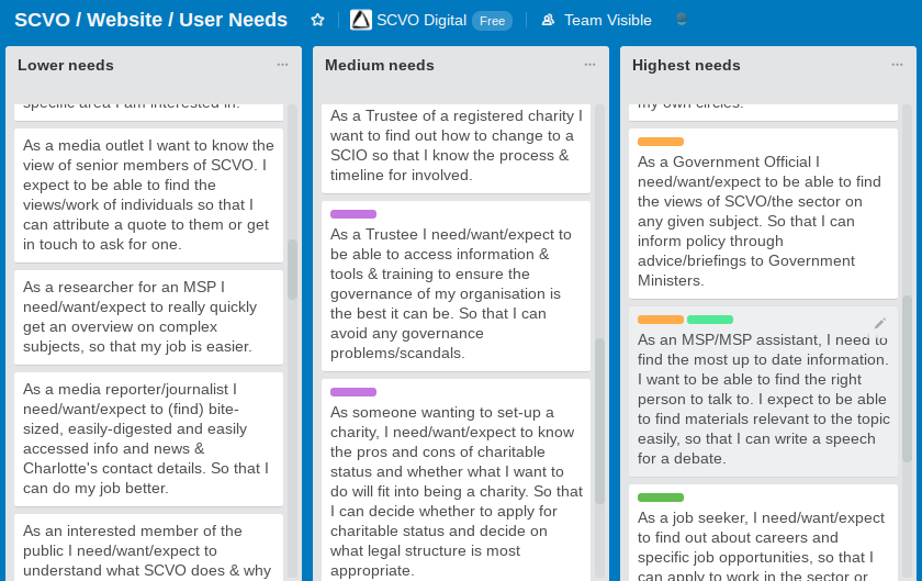
For teams with more expansive content requirements, we asked them to fill out simple forms asking for the profile of an expected visit to the website. This followed the format: "As a ... I need/want/expect to ... so that ..."
Examples:
As a non-member of SCVO I expect to find out about what SCVO is doing and see a snapshot of what is going on so that I can make an informed choice about whether to join.
As a member of a third sector policy team or Trustee of a 3rd sector organisation, I need to put across the views of my organisation. I want a broader sense of what is going on in the sector so that I feel engaged and can speak to a wider audience, and gain more knowledge outwith my own circles.
As a job seeker, I want to find out about careers and specific job opportunities, so that I can apply to work in the sector or move jobs.
We then asked participants of these meetings to individually score all the suggestions so that when the requirements were collated together we could see at a glance across the organisation what the highest priority needs were.

At the Gathering in 2017, we ran a number of surveys for each of our websites where we asked delegates visiting our stand for feedback on usability and ideas for improvements. This feedback helped inform the development and understand how our services are actually used by a wide range of people.
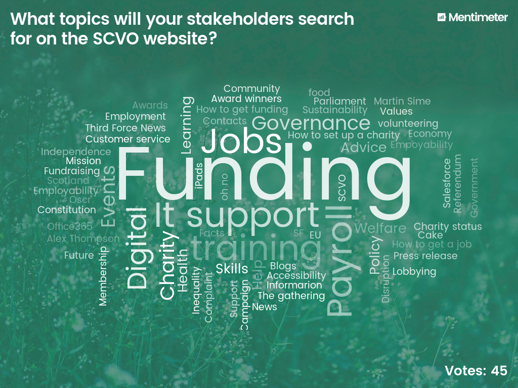
I also gave a talk at an all-staff away day where I used Mentimeter (a useful collaborative feedback/graphing tool for events) to produce the following word cloud from audience suggestions of what we think our stakeholders search for on the SCVO website. This doesn't match up with what Google Analytics says are the most popular search terms but is useful nonetheless as it surfaces staff perceptions of what key stakeholders are looking for.

Information architecture
Engagement with the rest of the organisation was an ongoing process beyond the initial engagement meetings to gather requirements, right up to and after launch. Communications team colleagues led on the re-working of text and improving navigational hierarchy. We wanted to avoid a situation with too many levels of navigation, as this can lead to a feeling of content being "hidden" and a confusing navigation structure (which was a failing of the old website).
A key concern around content presentation was that it should work perfectly on smaller screens and on mobiles. This meant stripping back complex layouts to a single column of text, and ensuring that each page isn't excessive in length.
As part of the technical development (more on that in another post), we needed to document content types - this helped us map out where search areas would sit within the page hierarchy and fully understand where content would be presented across the website. We surprised ourselves how many content types we required - from pages and posts to events and funded projects, all with their own requirements for presentation and search filter options.
Existing blog posts would be ported over to keep a history of what has been published and to allow for interesting relevant older posts to be shown alongside newer posts.
Design
Many of the main ideas for the design grew organically from previous iterations of the website and from recent redesigns of our other websites. We had in the previous year refreshed a number of our other services such as Goodmoves and Funding Scotland and had broadly adopted Google's Material Design language. We wanted to use the newly released Material Design Components system for interface elements and had a bold but familiar colour palette put together by our designer to be used in specific sections.
The design requirements were centred around accessibility - the website must be easy to read, including all appropriate accessibility features such as alternative text for images and be navigable with a screen-reader. We also required the design to be responsive - that is to say, it should be readable and navigable on smaller screens such as smartphones.
The design was to be fairly minimalist - using the angle from triangle logo to break up the header image to provide a colour block on the left-hand side to overlay the page title. We wanted the design to have clean lines, allow for full-bleed feature blocks and "cover" images behind page titles so that any promotional designs are not constrained by the structure.
The layout presentation such as menus, cards, lists, sub-navigation, content areas, sidebars, and related content was directly informed by Material Design - specific interface elements were taken directly from Material Design Components and tweaked as needed to fit the structure and design.
We were keen to achieve a level of consistency between the header and footer - and build a footer that would be suitably flexible to allow variations to be easily set up on our other properties.
There was scope in the use of header imagery to show off some of the great photography we have of our annual events such as The Gathering, and we asked the winners of the 2017 Scottish Charity Awards if they would allow us to have some professional photography of their operations taken that we could use on our website to promote their work and show real people working in the Scottish third sector, not stock photography.
Bringing it all together
We set about designing landing pages for each of the key areas that have a top-level navigation option. The most contentious of these was the Services section - as you would expect each area of the organisation had their own ideas about how this should be prioritised. Anticipating this, we set up the services page with each distinct service in a "card" with a logo or icon on a 3-column grid (2 on tablet screens, and a single column on mobile). Thankfully this was well-received so most of the discussion was around ordering and whether or not to include some specific services. This was mostly agreed by consensus.
The facility to show blog posts, press releases, authors, related posts, and post categories was pulled together extremely quickly thanks to the new website technology stack which will be described in a later blog post - as was the staff directory which also shows posts written by each member of staff, and related TFN articles for each post - facilities the old website wasn't able to offer.
We had a unique challenge in the provision of funding updates - previously the process had been to generate a list of newly published funds via an email bulletin then copy & paste the content into a password protected post that was then emailed out (along with the password) in the SCVO member bulletin. In a bid to simplify this process for colleagues, we developed a page that can generate a unique link for any given date range which can be sent out in the bulletin and automatically shows the appropriate funds when visited.
We exported the old Evidence Library database with the help of IT colleagues imported it into our Salesforce database. This allows us to manage documents in a cloud-based environment and the new website technology stack re-hosts files as required on a public CDN.
Migration of the Digital programme content was fairly straightforward as it was mostly text, and the old standalone website wasn't too dissimilar in structure and design. It also helps that we're part of the Digital team!
Beta testing
Once we were at a stage where we could show the rest of the organisation progress on the website I circulated the link to the beta version - first to managers, then to all staff. We asked for feedback primarily on the content directly relating to their area of work. The most important aspects of testing were to ensure that content was being displayed correctly - that it was simple to navigate and nothing was missed - and that there were no errors or presentational issues. We use BrowserStack for cross-browser testing which allows us to easily reproduce issues on a specific operating system and browser version.
The other aspect of testing ahead of the launch was to ensure the higher priority user needs that were identified in the requirements gathering phase were all adequately addressed. Once this was done and a deadline for feedback had passed we were ready to launch the new website.
Launch
We decided to do a soft launch several weeks ahead of our largest event of the year (the Gathering) so that any bugs could be addressed and new processes for publishing content could be practised. This meant that we quietly switched over to the new website first thing this morning and continue to post as usual without mentioning it (aside from a couple of tweets).
Please let us know if you've had a problem or found a bug with any of SCVO's websites!


